A Difficult Assignment
As Senior UX Designer and Researcher on this project, I was tasked with creating a better experience for the MedCost.com website users. However, two of the most used areas of the site were off limits (Provider Directory and Account Access). We couldn’t directly impact what 76% of users where trying to access.
Final UI design for MedCost.com
Original website homepage
Recognizing Assumptions
To help kick-off the project I facilitated an Assumption Smash workshop with the project team to help us recognize assumptions we were making and prioritize those that we needed to validate.
Photo of Assumption Smash team workshop.
Finding the Actionable Pain Points
In order to validate assumptions and understand user needs a website survey was conducted to collect information from visitors. This also helped us create a benchmark to measure success against.
We found many users struggled to login or didn't know what information they would get by logging in.
Text analysis of open-ended question on why users couldn't complete their task on the website
User Persona for healthcare providers
Providing Value to Users
I facilitated an ideation session focused on how we could provide value to the user. We used a fast sketching method to come up with as many ideas as we could and then evaluated the pros and cons of the ideas as a group.
Sketches from ideation session
Solving Problems with Navigation
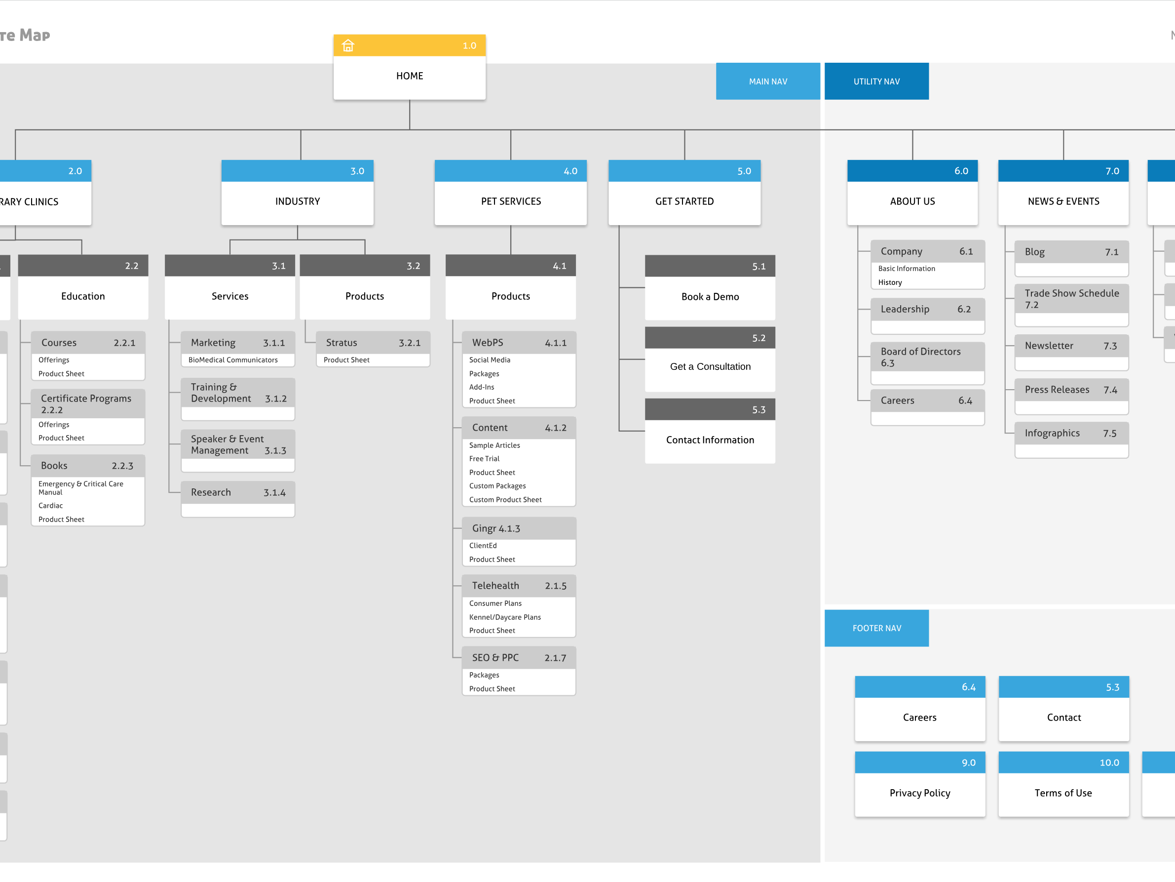
While the account login feature couldn't be directly impacted, the navigation could be improved by directing users to the right login screen and letting them know what they can expect to find once they login. Deep links provide access into the account, which were identified by a lock icon. Persona based navigation was also used to make sure each user type went to the correct login screen.
Mega menu wireframe showing deep links into account login section
Results
After launch a second survey was fielded on the website to understand what the impact had been:
146% increase in user satisfaction (NPS)
20% increase in site usability (task completion)
20% increase in site usability (task completion)
Role: Senior UX Designer & Researcher
Skills: Survey Design, Information Architecture, Interaction Design, Wireframing, Prototyping, Unmoderated User Testing, Benchmarking
Visit this website at: www.medcost.com
